This page is made for coding learning purposes only. All of the information is taken from MDN docs CSS reference page.
CSS (Cascading Style Sheets) is a declarative language that controls how webpages look in the browser. The browser applies CSS style declarations to selected elements to display them properly. A style declaration contains the properties and their values, which determine how a webpage looks.
CSS is one of the three core Web technologies, along with HTML and JavaScript. CSS usually styles HTML elements, but can be also used with other markup languages like SVG or XML.
CSS functions are used as a value for various CSS properties.
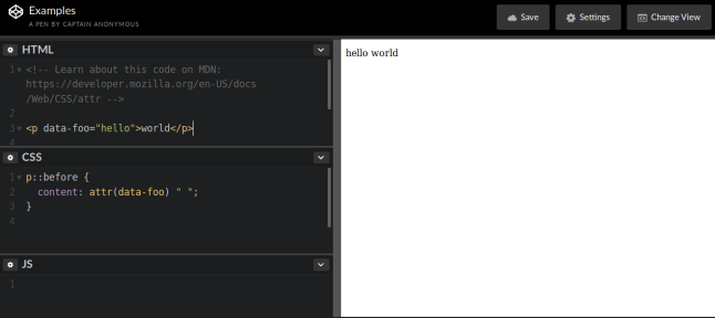
The attr() CSS function is used to retrieve the value of an attribute of the selected element and use it in the style sheet. It can also be used on pseudo-elements, in which case the value of the attribute on the pseudo-element's
originating element is returned.
Syntax
attr(<attr-name> <type-or-unit>? [, <attr-fallback> ]?)
Example
The blur() function is used with the filter property to apply a Gaussian blur to the input image.
Syntax
blur(radius)
Example
filter: blur(4px);
The CSS brightness() function is used with the filter property to apply a linear multiplier to the input image, making it appear brighter or darker.
Syntax
brightness(amount)
Example
filter: brightness(1);filter: brightness(50%);
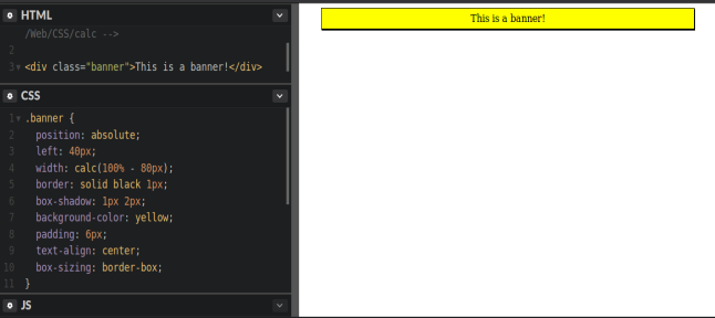
The CSS calc() function lets you perform calculations when specifying CSS property values.
Syntax
calc(<calc-sum>)
Example
The circle() function is used to define a circle.
Syntax
circle([<shape-radius>]? [at <position>]?)
The <shape-radius> argument represents r, the radius of the circle. Negative values are invalid. The <position> argument defines the center of the circle. This defaults to center if omitted.
Example
clip-path: circle(6rem at 12rem 8rem);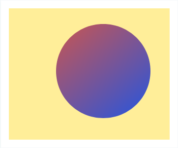
The contrast() CSS function adjusts the contrast of the input image. Its result is a filter function.
Syntax
contrast(amount)
The contrast of the result, specified as a number or a percentage. A value under 100% decreases the contrast, while a value over 100% increases it. A value of 0% will create an image that is completely gray, while a value of 100% leaves the input unchanged. The lacuna value for interpolation is 1.
Example
filter: contrast(1.75);filter: contrast(50%);
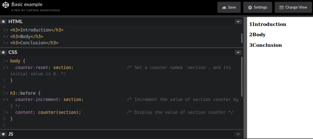
CSS counters let you adjust the appearance of content based on its location in a document. For example, you can use counters to automatically number the headings in a webpage. Counters are, in essence, variables
maintained by CSS whose values may be incremented by CSS rules to track how many times they're used. The value of a counter can be displayed using either the counter() or counters() function in a content property.
The counter() function has two forms: counter(name) or counter(name, style). The generated text is the value of the innermost counter of the given name in scope at the given pseudo-element. It is formatted
in the specified style (decimal by default).
The counters() function also has two forms: counters(name, string) or counters(name, string, style). The generated text is the value of all counters with the given name in scope at the given pseudo-element,
from outermost to innermost, separated by the specified string. The counters are rendered in the indicated style (decimal by default).
Syntax
counter(name)counter(name, style)counters(name, string)counters(name, string, style)
Example
The cubic-bezier() functional notation defines a cubic Bézier curve. As these curves are continuous, they are often used to smooth down the start and end of the animation and are therefore sometimes called easing functions.
A cubic Bézier curve is defined by four points P0, P1, P2, and P3. P0 and P3 are the start and the end of the curve and, in CSS these points are fixed as the coordinates are ratios (the abscissa the ratio of time, the ordinate the ratio of the output range). P0 is (0, 0) and represents the initial time and the initial state, P3 is (1, 1) and represents the final time and the final state.
Syntax
cubic-bezier(x1, y1, x2, y2)
x1, y1, x2, y2 are number values representing the abscissas, and ordinates of the P1 and P2 points defining the cubic Bézier curve. x1 and x2 must be in the range [0, 1] or the value is invalid.
Example
See hereThe drop-shadow() CSS function applies a drop shadow effect to the input image. Its result is a filter function.
This function is similar to the more established box-shadow property; the difference is that with filters, some browsers provide hardware acceleration for better performance.
Syntax
drop-shadow(offset-x offset-y blur-radius spread-radius color)
Example
filter: drop-shadow(0 -6mm 4mm rgb(160, 0, 210));
The ellipse() function defines an ellipse shape.
Syntax
ellipse([<shape-radius>{2}]? [at <position>]?)
The shape-radius arguments represent rx and ry, the x-axis and y-axis radii of the ellipse, in that order. Negative values for either radius are invalid. Percentage values here are resolved against the used width (for the rx value)
and the used height (for the ry value) of the reference box. The position argument defines the center of the ellipse. This defaults to center if omitted.
Example
clip-path: ellipse(115px 55px at 50% 40%);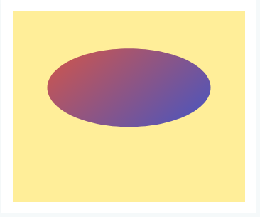
The grayscale() CSS function converts the input image to grayscale. Its result is a filter function.
Syntax
grayscale(amount)
The amount of the conversion, specified as a number or a percentage. A value of 100% is completely grayscale, while a value of 0% leaves the input unchanged. Values between 0% and 100% are linear multipliers on the effect.
The lacuna value for interpolation is 0.
Example
filter: grayscale(0.20);filter: grayscale(60%);
Colors can be defined according to their hue, saturation, and lightness (the HSL model) via the hsl() and hsla() functional notations. One advantage of HSL over RGB is that it is more intuitive: you can guess at the color you want, and tweak it from there. It is also easier to create a set of matching colors (e.g., by keeping the hue the same, while varying the lightness/darkness and saturation).
Syntax
hsl(H, S, L[, A])hsla(H, S, L, A)
H (hue) is an angle code of the color circle given in degs, rads, grads, or turns in CSS Color Module Level 4.
When written as a unitless number, it is interpreted as degrees, as it was specified in CSS Color Module Level 3.
S (saturation) and L (lightness) are percentages. 100% saturation is completely saturated, while 0% is completely unsaturated (gray). 100% lightness is white, 0% lightness is black, and 50% lightness is “normal.”
A (alpha) can be a number between 0 and 1, or a percentage, where the number 1 corresponds to 100% (full opacity).
Example
hsl(270,60%,70%)hsla(240, 100%, 50%, .05)
The hue-rotate() CSS function rotates the hue of an element and its contents. Its result is a filter function.
Syntax
hue-rotate(angle)
Example
filter: hue-rotate(90deg);filter: hue-rotate(3.142rad);
Defines an inset rectangle.
Syntax
inset(<shape-arg>{1,4} [round <border-radius>]?)
When all of the first four arguments are supplied they represent the top, right, bottom and left offsets from the reference box inward that define the positions of the edges of the inset rectangle. These arguments follow the syntax of the margin shorthand, that let you set all four insets with one, two or four values.
The optional border-radius argument(s) define rounded corners for the inset rectangle using the border-radius shorthand syntax.
Example
clip-path: inset(22% 12% 15px 35px);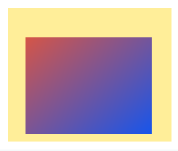
The invert() CSS function inverts the color samples in the input image. Its result is a filter function.
Syntax
invert(amount)
The amount of the conversion, specified as a number or a percentage. A value of 100% is completely inverted, while a value of 0% leaves the input unchanged. Values between 0% and 100% are linear multipliers on the effect.
The lacuna value for interpolation is 0.
Example
filter: invert(0.30);filter: invert(70%);
The linear-gradient() CSS function creates an image consisting of a progressive transition between two or more colors along a straight line.
The radial-gradient() CSS function creates an image consisting of a progressive transition between two or more colors that radiate from an origin. Its shape may be a circle or an ellipse.
Syntax
background: linear-gradient(direction, color-stop1, color-stop2, ...);
direction defines a starting point and a direction (or an angle) along with the gradient effect. If specified, it consists of the word to and up to two keywords: one indicates the horizontal side
(left or right), and the other the vertical side (top or bottom). The order of the side keywords
does not matter. If unspecified, it defaults to to bottom. The values to top, to bottom, to left, to right are equivalent to the angles 0deg, 180deg, 270deg, 90deg.
The other values are translated into an angle.
Color stops are the colors you want to render smooth transitions among. This value consists of a color value, followed by an optional stop position (a percentage between 0% and 100% or a length along the gradient axis).
background: radial-gradient(shape size at position, start-color, ..., last-color);
shape defines the shape of the gradient. Possible values: ellipse (default) and circle.
size defines the size of the gradient. Possible values: farthest-corner (default), closest-side, closest-corner, farthest-side
position defines the position of the gradient. Default is center
Example
background: linear-gradient(#e66465, #9198e5);background: linear-gradient(217deg, rgba(255,0,0,.8), rgba(255,0,0,0) 70.71%),
linear-gradient(127deg, rgba(0,255,0,.8), rgba(0,255,0,0) 70.71%),
linear-gradient(336deg, rgba(0,0,255,.8), rgba(0,0,255,0) 70.71%);background: radial-gradient(closest-side, #3f87a6, #ebf8e1, #f69d3c);
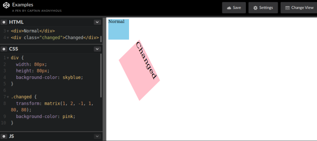
The matrix() CSS function defines a homogeneous 2D transformation matrix. Its result is a transform function data type.
The matrix3d() CSS function defines a 3D transformation as a 4x4 homogeneous matrix. Its result is a transform function data type.
Syntax
matrix(a, b, c, d, tx, ty)
a b c d are numbers describing the linear transformation.
tx ty are numbers describing the translation to apply.
matrix3d(a1, b1, c1, d1, a2, b2, c2, d2, a3, b3, c3, d3, a4, b4, c4, d4)
a1 b1 c1 d1 a2 b2 c2 d2 a3 b3 c3 d3 d4 are numbers describing the linear transformation.
a4 b4 c4 are numbers describing the translation to apply.
Example
The opacity() CSS function applies transparency to the samples in the input image. Its result is a filter function.
Syntax
opacity(amount)
The amount of the conversion, specified as a number or a percentage. A value of 0% is completely transparent, while a value of 100% leaves the input unchanged. Values between 0% and 100% are linear multipliers on the
effect. The lacuna value for interpolation is 1.
Example
filter: opacity(80%);
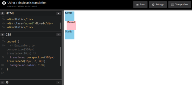
The perspective() CSS function defines a transformation that sets the distance between the user and the z=0 plane. Its result is a transform function data type.
Syntax
perspective(d)
d is a length representing the distance from the user to the z=0 plane. If it is 0 or a negative value, no perspective transform is applied. A positive value makes the element appear closer to
the user, a negative value farther.
Example
transform: perspective(800px);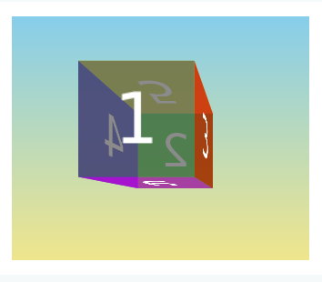
The polygon() function is a shape function used to specify a basic-shape.
Syntax
polygon([<fill-rule>,]? [<shape-arg> <shape-arg>]#)
fill-rule represents the filling rule used to determine the interior of the polygon. Possible values are nonzero and evenodd. Default value when omitted is
nonzero.
Example
clip-path: polygon(50% 2.4%, 34.5% 33.8%, 0% 38.8%, 25% 63.1%, 19.1% 97.6%, 50% 81.3%, 80.9% 97.6%, 75% 63.1%, 100% 38.8%, 65.5% 33.8%);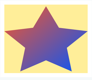
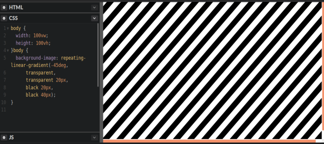
The repeating-linear-gradient() CSS function creates an image consisting of repeating linear gradients. It is similar to linear-gradient() and takes the same arguments,
but it repeats the color stops infinitely in all directions so as to cover its entire container.
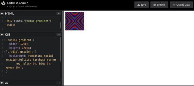
The repeating-radial-gradient() CSS function creates an image consisting of repeating gradients that radiate from an origin. It is similar to radial-gradient() and takes
the same arguments, but it repeats the color stops infinitely in all directions so as to cover its entire container.
Syntax
background: repeating-linear-gradient(angle | to side-or-corner, color-stop1, color-stop2, ...); background: repeating-radial-gradient(shape size at position, start-color, ..., last-color);
The gradient's shape value can be circle (meaning that the gradient's shape is a circle with constant radius) or ellipse (meaning that the shape is an axis-aligned ellipse). If unspecified, it defaults to ellipse.
Example
Colors can be defined according to their red, green, and blue components (the RGB model) by using hexadecimal and functional notations. The optional alpha component represents transparency.
Syntax
rgb(R, G, B[, A])rgba(R, G, B, A)
R (red), G (green), and B (blue) can be either integers or percentages, where the number 255 corresponds
to 100%. A (alpha) can be a number between 0 and 1, or a percentage, where the number 1 corresponds to 100% (full opacity).
Example
rgb(100%, 0%, 60%)rgba(51, 170, 51, .1)
The rotate() CSS function defines a transformation that rotates an element around a fixed point on the 2D plane, without deforming it. Its result is a transform function data type.
The rotateX() CSS function defines a transformation that rotates an element around the abscissa (horizontal axis) without deforming it.
The rotateY() CSS function defines a transformation that rotates an element around the ordinate (vertical axis) without deforming it.
The rotateZ() CSS function defines a transformation that rotates an element around the z-axis without deforming it.
The rotate3d() CSS function defines a transformation that rotates an element around a fixed axis in 3D space, without deforming it.
Syntax
rotate(angle)rotateX(angle)rotateY(angle)rotateZ(angle)rotate3d(x, y, z, angle)
A positive angle denotes a clockwise rotation, a negative angle a counter-clockwise one.
x, y, z are numbers describing the x, y and z coordinates and have values between 0 and 1.
Example
The example above is for the rotate() function. The other functions work similar. A syntax example for the rotate3d() function is:
transform: rotate3d(1, 1, 1, 45deg);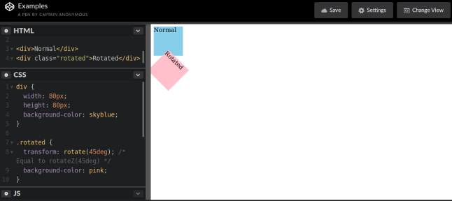
The saturate() CSS function super-saturates or desaturates the input image. Its result is a filter function.
Syntax
saturate(amount)
The amount of the conversion, specified as a number or a percentage. A value under 100% desaturates the image, while a value over 100% super-saturates it. A value of 0% is completely unsaturated, while a value of 100%
leaves the input unchanged. The lacuna value for interpolation is 1.
Example
filter: saturate(4);filter: saturate(50%);
The sepia() CSS function converts the input image to sepia, giving it a warmer, more yellow/brown appearance. Its result is a filterfunction.
Syntax
sepia(amount)
The amount of the conversion, specified as a number or a percentage. A value of 100% is completely sepia, while a value of 0% leaves the input unchanged. Values between 0% and 100% are linear multipliers on the effect.
The lacuna value for interpolation is 0.
Example
filter: sepia(0.20);filter: sepia(60%);
The scale() CSS function defines a transformation that resizes an element on the 2D plane. Because the amount of scaling is defined by a vector, it can resize the horizontal and vertical dimensions at different scales. Its result
is a transform function data type.
The scaleX() CSS function defines a transformation that resizes an element along the x-axis (horizontally). Its result is a transform function data type.
The scaleY() CSS function defines a transformation that resizes an element along the y-axis (vertically). Its result is a transform function data type.
The scaleZ() CSS function defines a transformation that resizes an element along the z-axis. Its result is a transform function data type.
The scale3d() CSS function defines a transformation that resizes an element in 3D space. Because the amount of scaling is defined by a vector, it can resize different dimensions at different scales. Its result is a transform function data type.
Syntax
scale(sx)scale(sx, sy)scaleX(s)scaleY(s)scaleZ(s)scale3d(sx, sy, sz)
sx is a number representing the abscissa of the scaling vector. sy is a number representing the ordinate of the scaling vector. If not defined,
its default value is sx, resulting in a uniform scaling that preserves the element's aspect ratio.
s is a number representing the scaling factor to apply on the abscissa of each point of the element.
sz is a number representing the z-component of the scaling vector.
Example
transform: scale(0.7);transform: scaleX(0.6);transform: scaleY(0.6)transform: scaleZ(1.4);transform: scale3d(1.3, 1.3, 1.3);
The skew() CSS function defines a transformation that skews an element on the 2D plane. Its result is a transform function data type.
The skewX() CSS function defines a transformation that skews an element in the horizontal direction on the 2D plane. Its result is a transform function data type.
The skewY() CSS function defines a transformation that skews an element in the vertical direction on the 2D plane. Its result is a transform function data type.
Syntax
skew(ax)skew(ax, ay)skewX(a)skewY(a)
ax/a is an angle representing the angle to use to distort the element along the abscissa. ay/a is an angle representing the angle to use to distort
the element along the ordinate. If not defined, its default value is 0, resulting in a purely horizontal skewing.
Example
transform: skew(15deg, 15deg);transform: skewX(10deg);transform: skewY(40deg);
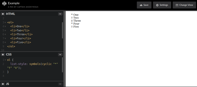
The symbols() CSS function lets you define counter styles inline, directly as the value of a property such as list-style. Unlike
@counter-style, symbols() is anonymous (i.e., it can only be used once). Although less powerful, it is shorter and easier
to write than @counter-style.
Syntax
symbols() = symbols(<symbols-type>? [<string> | <image>]+ );
<symbols-type> can be one of the following:
- cyclic: The system cycles through the given values in the order of their definition, and returns to the start when it reaches the end.
- numeric: The system interprets the given values as the successive units of a place-value numbering system.
- alphabetic: The system interprets the given values as the digits of an alphabetic numbering system, like a place-value numbering system but without 0.
- symbolic: The system cycles through the values, printing them an additional time at each cycle (one time for the first cycle, two times for the second, etc.).
- fixed: The system cycles through the given values once, then falls back to Arabic numerals.
Example
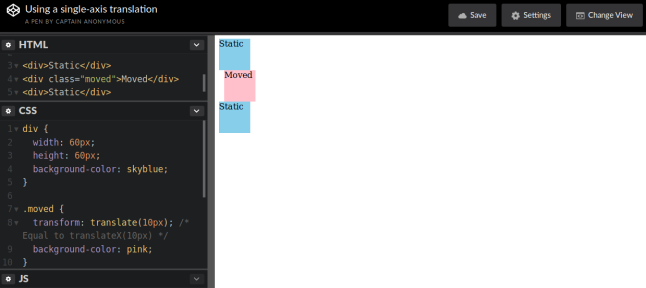
The translate() CSS function repositions an element in the horizontal and/or vertical directions. Its result is a transform function data type.
The translateX() CSS function repositions an element horizontally on the 2D plane. Its result is a transform function data type.
The translateY() CSS function repositions an element vertically on the 2D plane. Its result is a transform function data type.
The translateZ() CSS function repositions an element along the z-axis in 3D space, i.e., closer to or farther away from the viewer. Its result is a transform function data type.
The translate3d() CSS function repositions an element in 3D space. Its result is a transform function data type.
Syntax
translate(tx)translate(tx, ty)translateX(tx)translateY(ty)translateZ(tz)translate3d(tx, ty, tz)
tx is a length representing the abscissa (x-coordinate) of the translating vector. ty Is a length representing the ordinate of the translating
vector (or y-coordinate). If unspecified, its default value is 0. For example, translate(2) is equivalent to translate(2, 0).
tz is a length representing the z-component of the translating vector. A positive value moves the element towards the viewer, and a negative value farther away.
Example
The url data type is specified using the url() functional notation. It may be written without quotes, or surrounded by single or double quotes. Relative URLs are allowed, and are relative to the URL of the stylesheet
(not to the URL of the web page).
Syntax
<a_css_property>: url("http://mysite.example.com")<a_css_property>: url('http://mysite.example.com')<a_css_property>: url(http://mysite.example.com)
Example
ul { list-style: square url(http://www.example.com/redball.png); }
The var() CSS function can be used to insert the value of a custom property (sometimes called a "CSS variable") instead of any part of a value of another property.
Syntax
var(<custom-property-name> [, <declaration-value>]?)
custom-property-name is the referenced custom property’s name represented by an identifier that starts with two dashes. Custom properties are solely for use by authors and users; CSS will never give them a meaning beyond what is presented
here.
declaration-value is the fallback value, which is used in case the custom property is invalid in the used context. This value may contain any character except some characters with special meaning like newlines, unmatched closing brackets,
i.e. ), ], or }, top-level semicolons, or exclamation marks.
Example
background-color: var(--main-bg-color);
For more information on each CSS function acces MDN docs CSS reference page, go to the alphabetical index and search for the desired function.